
A book cover is the first and often only thing a potential reader evaluates before deciding whether to look further. In online retail environments where your cover appears as a thumbnail roughly the size of a postage stamp, the judgment happens in a fraction of a second. Understanding what makes a good book cover, and how those standards vary by genre and shift over time, is practical knowledge for any author or publisher making cover decisions.
This guide covers the core principles of effective book cover design, how to research what works in your specific category, and what the current trends in cover design look like across major publishing genres.
The Core Principles of a Good Book Cover
What Every Effective Cover Must Do
Pass the Thumbnail Test
The thumbnail test is simple: reduce your cover image to roughly 150 by 230 pixels, the size at which it appears in Amazon search results on most devices, and ask whether it still communicates clearly. The title should be legible. The central visual element should read as a recognizable shape. The overall impression should signal the genre to someone familiar with that category. A cover that works beautifully at full size but becomes a muddy blur at thumbnail size is failing at the most critical display context your book has.
Learn More: Kindle Ad-Supported vs. Without Ads: Which One Is Actually Worth It?
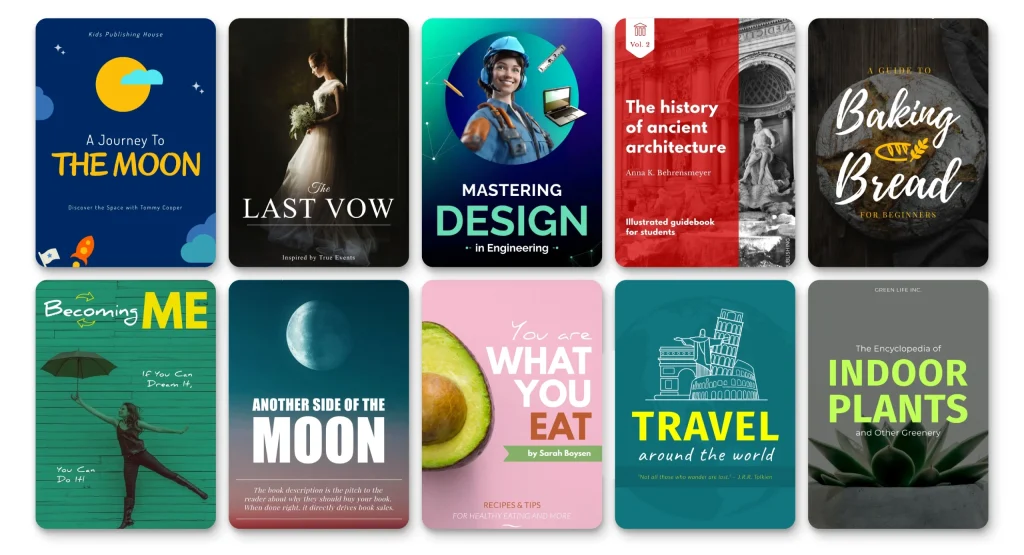
Signal the Genre Immediately
Genre conventions in book cover design are not arbitrary constraints. They are communication signals that readers have internalized over years of exposure to covers in their preferred categories. A thriller cover that looks like a literary fiction cover confuses readers before they read a single word. A romance cover that breaks from the visual language of the category loses readers who are actively browsing for more of what they already enjoy.
What makes a good book cover in any specific genre is inseparable from what that genre’s readers have come to expect. Breaking convention requires a very strong reason, and even then, the break should signal something specific rather than simply ignoring the conventions.
How to Research Book Cover Design for Your Genre
Building Your Cover Research Foundation
Using Bestseller Lists as a Research Tool
The most direct way to understand what makes a good book cover in your specific category is to study the covers of the current bestsellers. Go to your genre category on Amazon and look at the covers of the top twenty titles. What visual styles are dominant? What typography is being used? What color palettes appear repeatedly? What compositional approaches (full-bleed photography, illustrated characters, abstract typography) are most common? This analysis tells you what is working commercially right now in your specific market.
What to Look for in Your Cover Research
- Typography: serif vs. sans-serif, script vs. display fonts, uppercase vs. mixed case, font weight and scale
- Imagery style: photography vs. illustration vs. abstract design vs. typographic only
- Color palette: dominant hues, contrast levels, warm vs. cool, saturated vs. muted
- Composition: full-bleed backgrounds, centered subjects, negative space usage, layering
- How the author’s name is sized and positioned relative to the title
- Anything that appears on multiple bestselling covers that you had not noticed before looking specifically
Discover More: How to Get Libby on Kindle and Start Reading Library Books for Free
Genre-Specific Cover Trends in 2026
What Is Working Right Now
| Genre | Current Visual Trends | Typography Approach | Color Tendencies |
| Literary fiction | Minimalist, abstract, often illustrative or typographic | Elegant serif or clean sans-serif, often understated | Muted palettes, single accent colors, a lot of white space |
| Thriller and crime | Dark backgrounds, high contrast, atmospheric photography | Bold, often white or yellow type, high impact title | Dark navy, black, deep red, stark contrast |
| Romance | Illustrated covers increasingly displacing photography | Script or display fonts, often large and centered | Warm tones, pastels for sweet romance, bold for contemporary |
| Fantasy | Highly detailed illustrated scenes or character art | Custom or decorative display fonts, gold or metallic treatment | Deep jewel tones, atmospheric gradients |
| Science fiction | Clean, geometric, or photorealistic digital art | Futuristic or tech-influenced typography | Cool blues, greens, blacks, neon accents |
| Self-help and business | Clean, bold, often typographic with simple imagery | Strong sans-serif, large title treatment | High contrast, often single strong color with white |
| Memoir | Photographic, often intimate or atmospheric | Clean, readable, often author name prominent | Varies widely based on subject matter tone |
Common Book Cover Mistakes to Avoid
What Weakens Cover Effectiveness
Legibility Problems
The most common cover failure is text that cannot be read at thumbnail size. This usually happens because the type is too small, the color contrast between text and background is too low, or the font choice is too ornate to read at reduced sizes. The title of the book is the most critical piece of information on the cover, and if it is not immediately legible at the size most people will first encounter it, the cover is not working.
Genre Misalignment
A cover that does not visually match the genre it belongs to loses readers before any other element of the book can make an impression. This happens when authors try to create a cover that feels personal or unique without considering what signals they are sending to readers who are browsing by genre. Standing out from other covers in a category is desirable. Looking like you belong in a different category entirely is not.
Overcrowding
- Too many competing visual elements prevent any single one from reading clearly
- Multiple typefaces that create visual confusion rather than hierarchy
- Blurbs or marketing copy on the front cover that reduce space for the central design elements
- Imagery that is too complex or detailed to read at reduced sizes
- Competing colors that create visual noise rather than a coherent palette
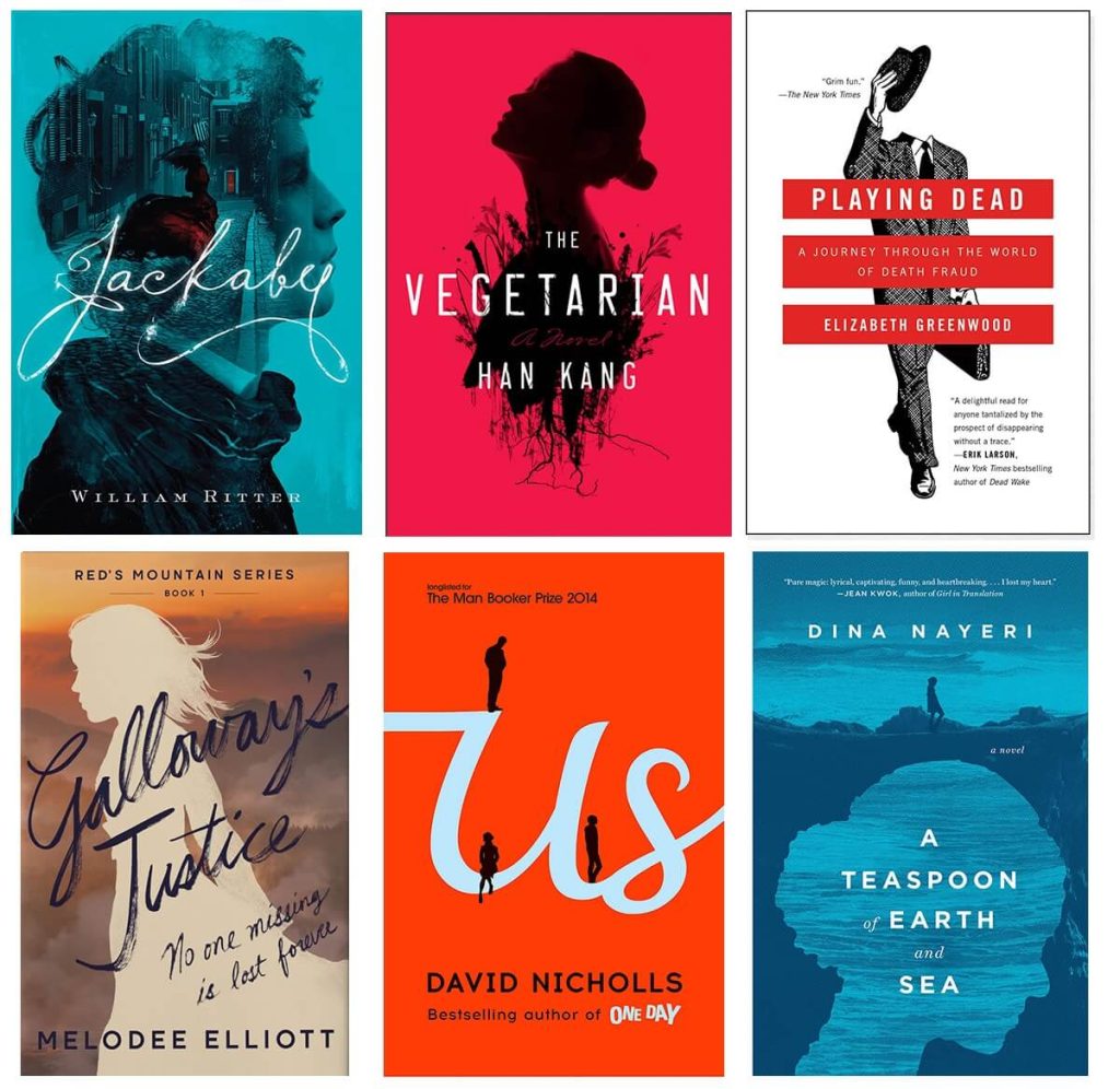
Working with a Cover Designer: What to Bring
Setting the Design Brief Up for Success
What Good Design Brief Information Looks Like
A cover designer can only work with the information you provide. A brief that says I want something that looks good tells the designer nothing useful. A brief that includes the genre, the target reader, five to ten comparable covers that are working in the market, specific elements that must be included or avoided, and the mood or emotional experience the book should convey gives the designer a real foundation to work from.
How to Evaluate a Cover Concept
- Does it pass the thumbnail test: clear, readable, distinctive at a small size?
- Does it signal the correct genre to a reader browsing that category?
- Is the title immediately legible at the size you would see it in an online store?
- Does it feel distinct from other covers in the category without feeling like it belongs somewhere else?
- Does it communicate the tone and emotional register of the book?
Read More: The 10 Questions First-time Authors Ask About Book Writing
Final Thoughts
A good book cover does its job: signals the right genre, catches attention at small sizes, communicates the book’s tone, and earns the click that takes a browser to the product page. The principles are clear. The application requires understanding your specific genre and category, staying current with what is working commercially, and investing in design work that meets a professional standard.
Research is the part most authors skip. Spending an hour studying the bestselling covers in your specific category before briefing a designer produces significantly better results than starting from a general aesthetic preference.
Vanguard Ghostwriting works with authors on every aspect of their book, from writing to publication readiness. If you want guidance on developing a cover brief or evaluating cover options, reach out to us.
FAQs
1. What makes a good book cover?
A good book cover passes the thumbnail test (clear and readable at small sizes), signals the correct genre immediately to readers familiar with the category, has a legible title, creates a coherent visual impression, and feels distinct within its genre without being misaligned to it.
2. How do I research what makes a good book cover for my genre?
Study the top twenty bestselling covers in your specific category on Amazon. Analyze typography, color palettes, imagery style, and composition. Look for patterns that appear across multiple successful covers. This research tells you what is working commercially in your specific market right now.
3. What are the most common book cover design mistakes?
Legibility problems at thumbnail size, genre misalignment where the cover looks like it belongs in a different category, overcrowding with too many competing elements, font choices that are too ornate to read at small sizes, and low contrast between text and background.
4. How much does genre affect book cover design?
Genre conventions in cover design are significant commercial signals that readers use to identify books they are likely to enjoy. A cover that breaks genre conventions without a clear reason creates confusion rather than distinction. Studying and generally respecting genre visual conventions while finding ways to be distinctive within them is the most effective approach.
5. What should I tell a cover designer in my brief?
Include the genre, the target reader profile, five to ten comparable covers that are currently working in the market, any specific elements that must be included or avoided, the mood or emotional experience the book should convey, and any practical requirements like text that must appear on the cover.